Saturday, April 12, 2008

Oil Painting Lesson on Glazing for Roses and Fruit, 14" x 18"

Day Two: I got into the studio early today excited with the anticipation of finishing my recent painting. Although I enjoy my direct ala prima paintings, nothing lights my fire more than bringing a painting up to a polish. Normally, I spend a lot more time on my polished pieces, but either I'm getting faster or I'm getting less "tight" on a lot of things that used to take me days. It's probably something of both as I enjoy a more painterly feel but also like the polished look that that extra session or two gives. OK, nuff talk. Except there is one thing. I forgot to add this pic of my cats who had snuggled together for warmth in the studio patiently waiting for dinner yesterday. Rough life.


All right. When I got in the studio this morning I tested the painting to see where it was dry and where it might need more time. As I suspected, most of the painting, except for the white vase was dry. White - except for underpainting white - has a lot more oil in it and takes significantly more time to dry. No matter, I figured I could still swing a decent glaze on it. Before I began, I oiled out on most of the canvas that was dry with a bit of Maroger medium.


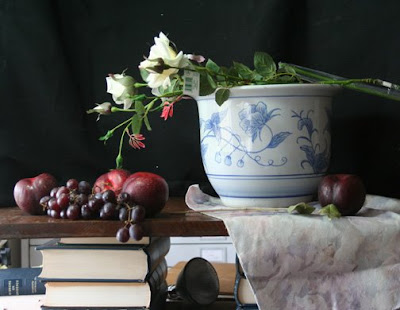
As you remember, I had intended to darken the background a bit and so first thing I mixed a glaze composed of thalo green, alazarin crimsen and a touch of raw umber. I laid this in with a very large soft sable brush. I mainly stayed on the edges of the painting. My intent was to bring out the light in the center of the piece and around the flowers.


I like the way this came out. Glazing into a background provides a feel of stained glass. The light hitting the canvas goes through the glaze until it hits the canvas and then bounces back. If you use pure glaze (which I haven't) from the start, the effect is quite dramatic. It bears saying here that if you intend to do your entire painting by building up all transparent glazes, then you need to make your underpainting nearly perfect and about three keys lighter than the actual values you want to achieve. The reason for this is because the multiple glazes will darken the image significantly as you proceed. I like to use a combination of opaque paint and glazes. If done correctly, this can still be quite dramatic.


My next step was to work on the fruit. Using the same combination of cad red light, alazarin crimson and cad yellow with varying degrees of naples yellow, I built up the color tops of the plums.


Then using some quinacradone magenta mixed with the alazarin crimson, I created a glaze and darkened areas of the fruit where the turning edges where and the shadows.


I used a little cad red adjusted with the magenta to make some reflected light on the plums. In cool light set-ups, the reflected light on objects is generally warm. The last step was to mix a small amount of the magenta with white and scumble this on to create the bluish haze of the plums.


For the grapes I followed much the same steps but used a bit of cad orange to create the transparent color of light passing through the grapes.


The highlights were the same color as the bluish scumble but with a tad of naples to warm and lighten them. After applying them, I took the back of my brush and squiggled it on each highlight.


The last detail for the grapes were touches of red here and there and then, of course the stems. Just some yellow ochre. I thinned the mixture with some copal painting medium and used a small round for the detail.


At this point, I lightened the table cloth and brightened the top a bit with a scumble of naples yellow and white. If you can't get it bright enough on the first day, you usually can on the second. That cloth lit right up. I did the same for the table top, keeping my lights close to the fruit. I also used a bit of glaze in the shadows of burnt umber to darken the cast shadow directly under the fruit.


Now I turned my attention to the pot. I mixed a glaze of ultramarine blue and a bit of cobalt. I thinned this out quite a bit with Maroger and using that same small round sable brush, I laid in the design. Once I was finished with the basic design, I went back in with a liner brush and put in the outlines and details on the design. This didn't take quite as long as you might imagine. Probably the most difficult part was the single line at the top and bottom. I simplified the design overall by skipping another horizontal line that appears on the actual pot.


Lastly, I put in the reddish leaves you see on in the foliage and then using some darker blue/green glaze, I pushed some leaves back and scumbled some into the fore ground. I checked edges to be sure the ones I wanted sharp, were sharp and the rest I softened. At this point I took a cup of coffee, sat back and just visited with the patient for awhile. The last thing I did before signing the piece was to mix another darker glaze for the base of the cloth. I darkened it and then also put in the other side of the cloth behind it. If you take a look at my daily painting blog, you can get a close up of the flowers. Viola. Done.

Friday, April 11, 2008

Painting with a Grisaille Underpainting, Fruit and Flowers with an Asian Vase, 18" x 13" on Canvas Panel

I've been wanting to do a larger piece for my blog and today seemed like a good time to start. I've also been wanting to experiment with a black and white grisaille under painting. Normally I would have chosen to do one of these in a lead white under painting oil with a bit of medium to ensure overnight drying. But I was in a bit of a hurry and pressed for time, so I opted for acrylic. Also, as I'm pretty busy with a lot of work these days, I thought it would be interesting to see if I could get similar results.

Here's the set up. The light is cool north light from windows on the left. It looks pretty unimpressive here. But wait. That's the fun part.


I broke out the acrylic black and white and pulled started in.


As you can see, I just indicated in my initial sketch where everything but the flowers would be. Detail wasn't important here. One of the reasons I was eager to try acrylic is the short drying time. I felt it would allow me to get in my values and still rearrange things as I pleased without making mud or having to wait a couple of days for things to dry before I tried again.


I was correct and this was the part I really enjoyed. I was better able to visualize my concept as it evolved and make changes quickly.


Here on the left, I've all but finished the under painting. One thing I enjoyed about this process was the ability to play with brush strokes and immediately be able to correct them. It was like making a road map for the painting.


At this point, I was pretty satisfied with the values and moved on. Just a note here...the vase is a bit off and I corrected that before moving on and applying paint.


I struggled for awhile in deciding what color I wanted to use for the background and decided that a cool green would be nice. It would work well with the roses and the red fruit.

I mixed some thalo green, raw umber and a touch of thalo blue to cool a bit to the blue side. Naples yellow and white lightened the mixture where needed. I apologize for the glare here. The window was to my back and my easel was set up a bit perpendicular to the set up. It didn't look glaring to me, but the camera picked it up.
I could tell my values were correct by squinting down. I spend a lot of time squinting at my canvases and this is because it allows me to see values. If the color and the gray background show no contrast when I do this, then I know I've hit it correctly. I used some of the background color and placed it on the vase about where the core shadow would fall.


Next I painted the first coat for the vase. I used some of the background color and a mixture of naples yellow and white for the midtone and then a straight mixture of the naples and white for the lights. I used a pretty heavy application of paint and a healthy dose of Maroger medium here too. I wanted the paint to set up quickly so that I could continue to come back to it and add more paint and glaze if necessary.


Now for the fun part. I took some Maroger and mixed it up with some alazarin crimson to make a glaze and laid this into the plums. Whoa! I love glazing. All that light stuff you see? It's primarily glaze over a monochromatic under painting. Nice huh? The grapes too. I've made a mixture for the cloth here as well. I used white, umber and a touch of the crimson to make a warm shadow and pushed that into the base of the cloth. I lit the top side of the table. This is actually the reverse of what shows on my set up. This is because I have two windows and the one over my left shoulder sheds light onto the front of the set up. I have to compensate for this by painting the front darker at times then it would normally appear.


Using a similar mixture of the naples and white, I started laying in the flowers. I wanted to do this before the background completely dries and it would be difficult for me to create the atmosphere that I strive for on a dry background.

OK. I figured out at this point that glare was becoming a problem in the photos so I moved the easel away from the window to shoot this picture. Here you can see that I've started to put in quite a bit of detail. I added dark leaves to the background to make them fade into the background.


I've also taken a small mixture of cad orange, cad red light and naples yellow to make a orangy pink mixture for the top of the plums.

More dark foliage in the back of the fruit. I've painted some leaves in the fore ground and put in their shadows.

Additionally, I've enhanced the vase and put in some shadow under the rim. The table top is lit a bit more and I've darkened the background in the corners.

Some of the petals on the flowers were enhanced with a little yellow ochre and white.

I'm leaving the rest for tomorrow as I need the vase to dry before adding the glaze. Same for the fruit which needs a lot more work. Remember plums have a nice blue/white haze to them. I'll add more detail to the leaves, pushing some to the back and pulling some forward. I also intend to glaze into the background bring a bit more heightened interest to the center of the painting. So far I'm liking the progress. More tomorrow.

Monday, April 7, 2008

How to Paint White Roses

"White Roses on a Rainy Day"
9" x 12" Oil on Canvas Panel


It was raining today and my body hurt from an overkill on exercise (too much racquetball and hiking). I had a bad start to my day and it was raining out. I needed to do a supply run and by the time I got to my studio, I was exhausted and in a rough mood. But work harkened and I answered the call. Actually I welcomed the silence and stillness of my studio today and once the door was closed, I relaxed into my chair and began the piece I'm going to demo tonight while Nalie (Boo Boo), my cat, sleeps on my lap.

I started with a simple lay in of values with raw umber. I usually do more of an underpainting, but felt a bit pushed for time because of my late start so I took a short cut. At first I considered doing my background in a greenish umber so I laid that in and lightened some of the space to the left of the vase by adding cobalt blue and naples yellow.


The cloth was green so I started laying in the shadows with a mixture of sap green and some alazarin crimsen.


There's a bit of quinacradone magenta mixed with the umber wich I just splashed on behind the flowers on the table cloth. Not sure if I wanted this to stay or not at this point.


Here I've just finished laying in the background - right over that red and nothing much has changed.


Except that my Maine Coon, Simba, decided to join me by pushing against the door. After much complaining, I got him a pillow and made him comfortable. Dogs have owners, cats have servants.


I picked up this vase at a garage sale for a song and love it because of the great floral design on it. This sort of thing can be daunting for a newbie painter and even for an experienced painter it can provide a challenge. If you just treat the design as part of the whole vase, you'll have less problems. The design actually helps to describe the shape of the vase. I mixed the colors needed for the blooms with mixtures of naples yellow, cad red light and small amounts of yellow ochre. The greens were mixtures of sap green, alazarin crimsen for muting and darkening and cad yellow light and sap for the leaves on the vase. I tried to pay attention to the values of the decorations on the surface of the vase. In other words, if a flower was in shadow, it was the color of the flower in not the local color of the flower. At this point, the vase looks pretty flat and sort of pasted onto the background. Things are still pretty raw.


Here you can see that I've softened the edges of the vase. With a lightened version of the background color on the shaded side (right), I've laid in the shadow shapes for the roses. For the darker tones on the left side (lighted side) I've worked in some yellow ochre and touches of cad orange.


I thought that it would be nice to warm up the background a bit so I added a touch of cad red and white with a touch of quinacradone violet to the lighter areas of the background and pulled some of it into the vase for atmosphere. I've also started to add in leaf color here too and build shadows under the leaves with darker strokes of sap and alizarin crimsen. You'll notice that I put a little light behind the vase on the right side beyond it's shadow. This gives the illusion of depth to the painting. I've added some details to the flowers on the vase by putting in some dark accents.


Boo Boo came into the studio at this point and also complained mightily that Simba had the best chair and what was he supposed to do? Sit on that cold floor? Hmph. OK. Out came my felt vest and a warm place was made for him next to Simba. At least he wasn't walking through my palette - something he's done on at least one occasion before.


OK so settling in again, I started to add the lights in the roses. I made up a mixture of naples yellow and white and thickened it up a bit with Maroger Medium. Great stuff. Using a small 1/4" filbert bristle, I scooped up gobs of the mixture and laid it in on the edges of the blooms where I wanted the most light. I literally sculpted the flowers. Using a soft 1/2" soft bright sable, I made sweeps to suggest the broader edge of petals as in the flower laying on the table top. I've also pushed in the leaves here as well and suggested some up at the top near the blooms. I made the flower at the top larger to balance the bouquet better. Hmm. Still looking a bit flat at this point.


Well. It may have looked flat, but there wasn't that much left to do. I brightened the background, added some darker notes to the flowers and punched up the details on the vase flowers.

The vase still needed some dimension so I added a few darker notes to it's right side and some lit ones to the left. I created a cast shadow on the vase from the rose that is drooping on the left. Then I added some dimension to the leaves by sculpting them with a palette knife. Final touches were added by putting some lights on the table cloth and deepening the shadow under the vase. A little dab of reflected light on the right side of the vase and I was done. There's a better close up of the flowers on my other blog http://www.susanmartinspar.blogspot.com.